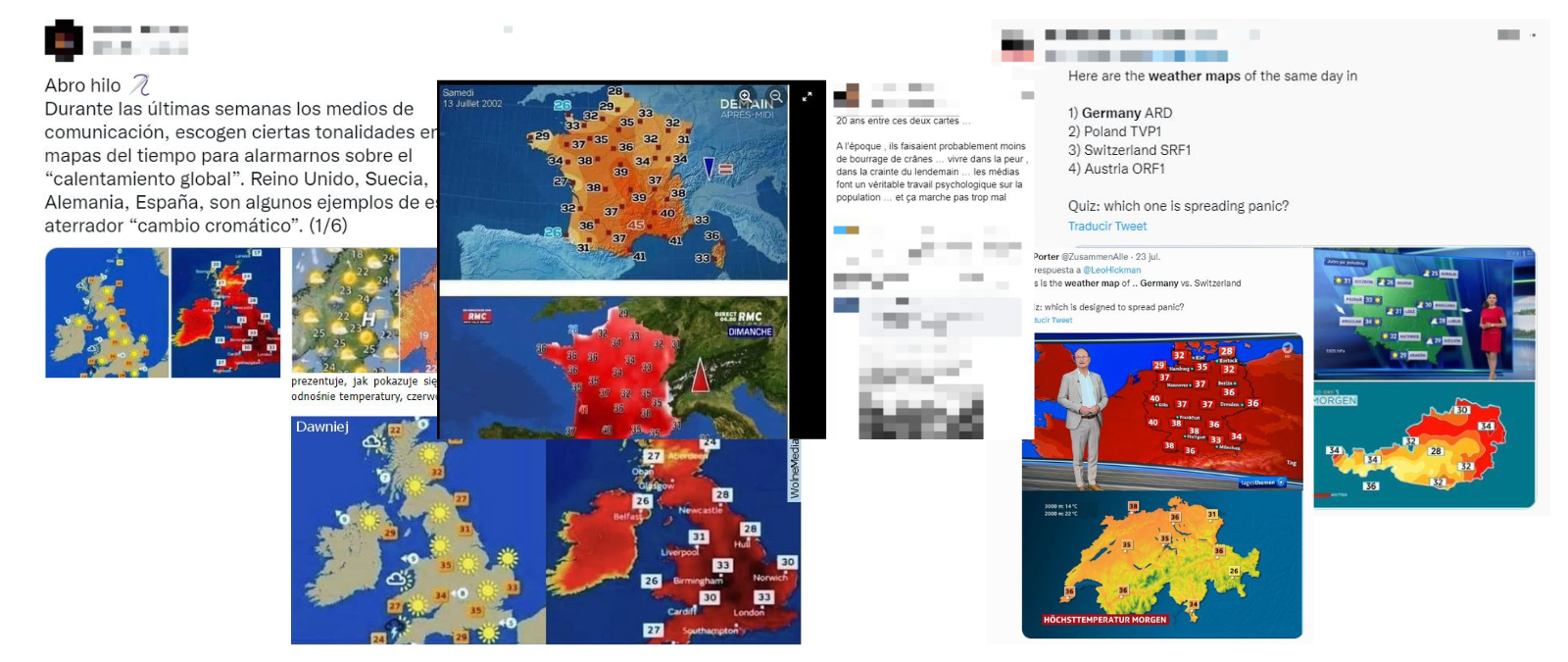
A Facebook user in Georgia accuses Roberto Brasero, Spanish weather TV presenter, of deliberately manipulating his weather forecast. Meanwhile, a Twitter user with a German username says that both Germany and Austria are “spreading panic” by exaggerating the colors of their weather maps to represent current temperatures. What do all these phenomena have in common? Disinformation about climate change knows no borders, and this new conspiracy theory about the alleged “chromatic change” is causing improbable situations as a Georgian citizen questioning a Spanish weather anchor’s forecast. This is a specific type of disinformation that precisely disinformers use to claim that climate change doesn’t exist. They also say that weather forecasts are deliberately manipulating the colors of their maps to spread fear. But it’s a false claim: all of these posts are trying to compare maps that express different things (hence, they can’t be compared).
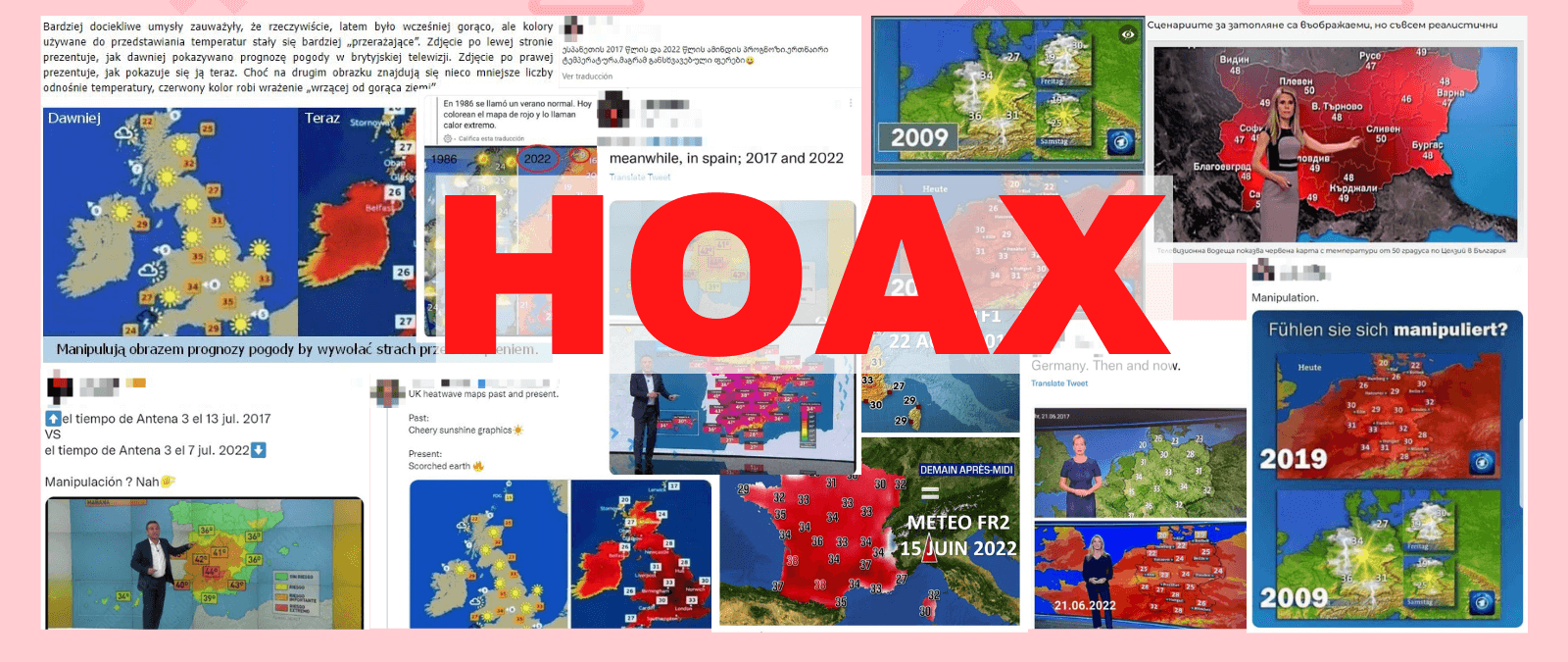
We have seen this kind of comparison of alleged weather maps being shared in the UK, Germany, France, Sweden and Spain, among other countries. They point out TV networks and accuse them of manipulating weather forecasts with the goal of exaggerating climate change. However, it’s a hoax, and in Maldita.es we are gathering all these disinformations in a compilation about what the different elements of the weather maps really mean.
In the elaboration of this article we have counted with the collaboration of the following fact-checkers: Evita Puriņa (from Re:Baltica), Elena Calistru and Ana Poenariu (Funky Citizens), Tommaso Canetta (Pagella Politica), Pawel Terpilowski (Demagog), Thanos Sitistas (Ellinika Hoaxes), Viola Keta (Faktoje.al), Mariam Tsitsikashvili (Grass), Jelena Berkovic (Faktograf) and Andreas Søndergaard Petersen (TjekDet.dk).
These are some of the keys to avoid being fooled by the hoaxes of the supposed "chromatic change":

One of the techniques that disinformers use is a misleading comparison of a topographic map (which does not change its colors) and another of temperatures (which does)
One of the most notorious cases is this comparison of two weather maps of Germany that, supposedly, ensure that temperatures that in 2017 were colored in green are colored in red nowadays. This map has circulated, among other countries, in Georgia, Denmark and Spain. However, as we already explained in Maldita.es, it is a hoax and this comparison was misleading: the first map released with green colors was actually a topographic map (which does not change its colors) from 2017, and the second, a temperature map (which does change them) of 2022. Therefore, they cannot be compared. A key element to detect this type of disinformation is knowing how to differentiate between a topographic map and a temperature map.
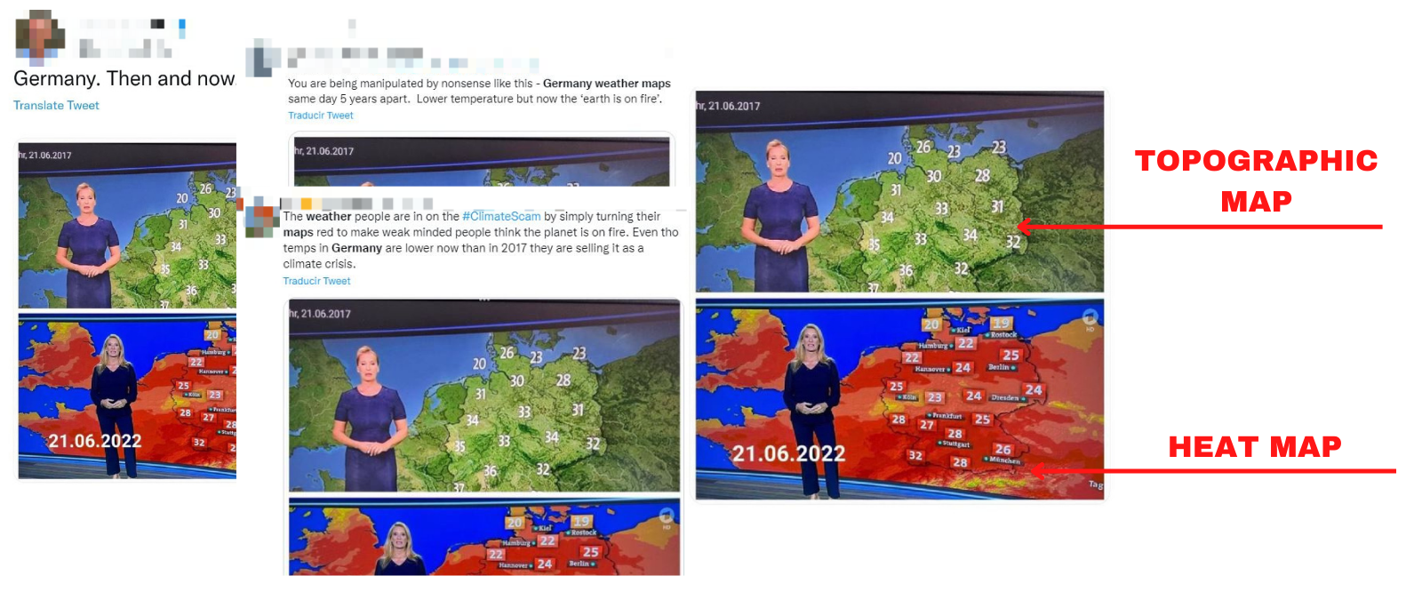
Topographic maps are images that show the relief of the earth's surface. Sometimes they include geographical features such as rivers, lakes, etc. Other times, they simply show different colors (within the same hue, usually green) to represent the height of the different mountain ranges in the territory. These maps are seen in the various broadcasts of weather programs very frequently, and correspond to most of the "green" maps that use disinformation about weather maps.
However, although these maps can be shown with numbers on top to reflect the temperature forecast, or with suns and clouds to show the weather forecast, as a general rule they do not adapt their colors to the temperature that it is. That is, a topographic map will be green if it shows a number above it with, for example, a temperature of 49 ºC, but it will remain green if it shows another of 5 ºC.
On the other hand, temperature maps or "heat maps" are maps that show the temperature that is expected over an area, adapting its colors. There are many types and each television network, and even each program, can use its own color codes for this type of map (red does not always have to correspond to a high temperature, and green to cold).
Suns and clouds icons on a weather map do not indicate the expected temperature (nor do they have to change their colors depending on it), but the weather forecast
Another case that Maldita.es has detected circulating in several countries and with different maps are the comparisons between maps that reflect the weather forecast with suns and clouds icons (that is, if the weather is expected to be sunny, cloudy, etc.) and other types of maps, usually temperatures maps. Reflecting maps can adapt their colors to the expected temperature, but they don't necessarily have to. The combinations are endless and each television network, as well as each program, has its own style.
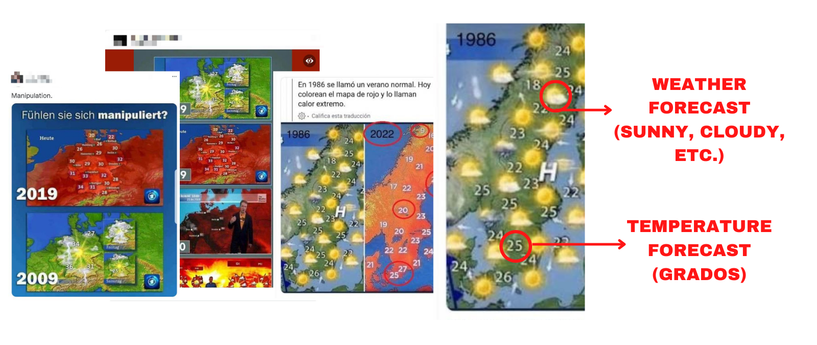
This was the case of content that circulated showing a supposed comparison of two Swedish weather maps and that we have seen propagate in Spanish, but also in English (see 1, 2). But it is a hoax. This was also the case with another map of Germany that we have seen circulating through users in social media networks in Austria, Spain, France, the Netherlands and Norway, among others. However, they are all hoaxes and, although each case has its particularities, they all refer to the phenomenon that we have explained.
In these cases it is important to remember that, on a weather forecast map, a sun will appear if the weather is expected to be sunny, no matter if 15ºC or 45ºC temperatures are expected. Therefore, this can’t be compared to a temperature map that will adapt its color depending on the expected temperature. Like in the map of Sweden, even the same map (topographic, which does not change its colors) can include a temperature forecast (expressed with numbers) and a weather forecast (reflected with the sun). The important thing is not to confuse them.
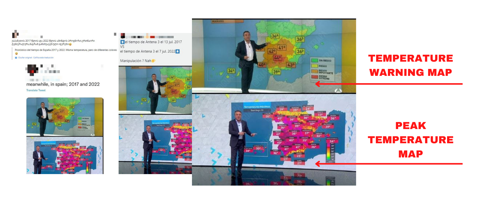
A map of meteorological warnings and another of forecast maximum temperatures expected are not the same
Another case that has circulated in Spain, but that has also reached other countries such as Georgia and has been broadcasted in English, was that of Roberto Brasero's weather forecast on Antena 3 (a Spanish TV channel), which also faced accusations of manipulation and "exaggeration" with the color of temperatures. Brasero himself explained on Twitter that the broadcast content of 2017 and 2022 could not be compared because they showed different things. The maps used different color ranges, since the first (with green and softer colors) was a map of warnings for temperatures, and the second, a map of maximum temperatures.
In addition, Brasero provided two weather maps of the same type, warning for temperatures, of the two days to which the disseminated content supposedly referred. If we look, we can see that it is indeed a question of different color ranges, and that in 2022 soft colors (yellow and green) are still used in this type of temperature warning maps.
Many weather programs change the style and colors of their maps over time, with the seasons, or even with different presenters
Finally, one of the most important elements to keep in mind when dealing with disinformation or misinformation about climate change is that, for reasons of style, each TV channel, each program and even each weather forecast presenter may have a different style. This can involve using different colors for their maps, different ranges or shades, different symbols, etc. Therefore, it is necessary to be very careful when comparing weather maps that belong to different programs, and even more, to different countries.
Maldita.es explained that this type of disinformation has occurred with maps of the United Kingdom or France, among others, which were compared even though they belonged to different channels and used different styles. Although recently they have also circulated on networks with maps of Bulgaria, Poland, Switzerland, Austria, etc.
In any case, all of them compared maps of different TV channels that used different color codes, or in the case of the United Kingdom, they disinformed about the date in which the map had been published (which was not current but from 2016, when those temperatures could be considered extreme and colored red).